
This is a type of post so many other book bloggers do so I decided to weigh in with my own opinions! There are surprisingly a TON of differing covers between the UK and the US so I just picked a couple of books I love or ones with covers I love!
These are also in no particular order!

Caraval by Stephanie Garber

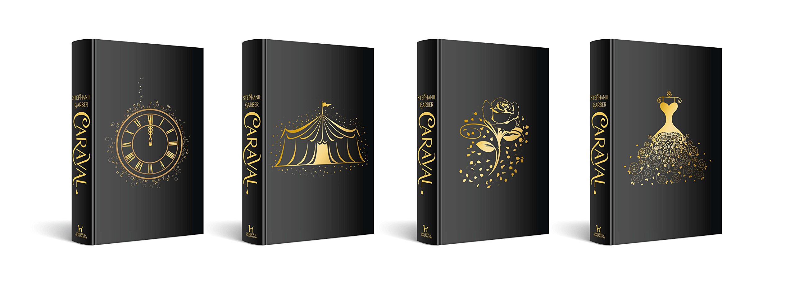
Winner: U.S. Cover
This one was actually really hard for me to pick between because both covers are so gorgeous! I especially love the naked covers for the UK edition but something about the blue and black coloring and typography on the US cover draws my attention more. It’s darker and a little more mysterious looking which I like more. I don’t own a copy yet but I tell ya it’s going to be hard deciding what edition I really want still……
Strange the Dreamer by Laini Taylor
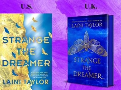
Winner: U.K. Cover
I like both covers and I hate both covers, let me explain: they’re both gorgeous in their own ways but I have Lepidopterophobia which is a fear of the butterfly family which includes moths. That’s right I’m a big baby who is terrified of butterflies and moths! So these covers both creep me out but are still pretty, I’m a mess. Pretty much the ONLY reason I’m picking the UK cover over the US cover is because the UK edition has blue pages!
And I Darken by Kiersten White

Winner: U.K. Cover
I REALLY LOVE BOTH OF THESE, THEY’RE BOTH SO BEAUTIFUL! However, as much as I loved the pretty purple flower being impaled I just have to say I love the UK cover a bit more. I usually don’t like cover models but this one is amazing because it shows Lada’s character perfectly.
An Ember in the Ashes by Sabaa Tahir

Winner: U.S. Cover
I actually like the original cover for “An Ember in the Ashes” more than this current US edition but that’s a topic for another post….
I like the sand, typography, and the character’s billowing cloaks a lot more than the more simplistic UK cover that doesn’t have much except some sparkly looking embers.
The Hate U Give by Angie Thomas

Winner: U.S. Cover
As I’ve said before I don’t really like cover models and/or faces on my book covers, they just aren’t as appealing to me. I much prefer the US cover that has a more minimalist approach to it.
And The Trees Crept In/ The Creeper Man by Dawn Kurtagich
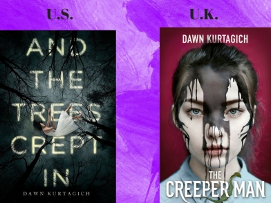
Winner: U.S. Cover
As much as I like how creepy “The Creeper Man” cover is and how the shadow of the creeper man is over her face, I just like the much prettier US cover better. The US cover is not only very pretty but also still very eerie at the same time.
Mistborn: The Final Empire by Brandon Sanderson

Winner: U.K. Cover
Once again I’ll say I don’t much care for people/faces on my book covers so of course I’m going to go with the UK cover that has a very pretty, simple white background with some blue!
Throne of Glass by Sarah J. Maas

Winner: U.K. Cover
These book covers are virtually the same thing except I really LOVE the white background with the blue on the UK Cover….very similar to the Mistborn ones….
Heartless by Marissa Meyer

Winner: U.S. Cover
That UK Cover……honey no. I like the crown, sword, and vines against the black background much better than the face on the white background.
My Lady Jane by Cynthia Hand, Brodi Ashton, and Jodi Meadows

Winner: U.S. Cover
I’m sorry but the UK cover for this one is super ugly, I honestly don’t know why they wouldn’t just use the US cover for both because it’s so much better. I love the cover model more and the typography covering everything as well!
Nevernight by Jay Kristoff

Winner: U.S. Cover
Once again this one was really close because I really like both covers but I have to say I like the US one more only because I love the title’s font, otherwise I’d pick the UK one since that raven is gorgeous and I love the book quote.
Alice by Christina Henry
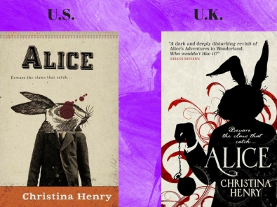
Winner: U.K. Cover
While I do enjoy the US cover and love how creepy it is I think I like the UK cover better because of the swirling design and clocks!
Daughter of Smoke and Bone by Laini Tayor

Winner: U.K. Cover
I really do like the pop of color on the US covers but it doesn’t really have anything to do with the story itself which is why I like the UK cover more. The UK cover is actually more relevant to the story and ties in better.
A Darker Shade of Magic by V.E. Schwab
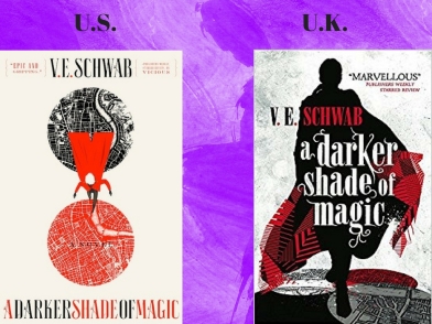
Winner: U.S. Cover
I do really like both of these covers as well but I don’t really like how the entire series of UK covers all look exactly the same just with different character silhouettes. I like the differing covers with the US series and I really enjoy how minimalistic they are.
Which covers are your favorite?
Do you prefer any of these US or UK covers over the other?
Have you read any of these books? What did you think?
Let me know in the comments!


I kind of prefer the second cover of The Hate U Give, mainly because I don’t like white backgrounds and I’m a fan of the typography! 😉
LikeLiked by 1 person
The typography is definitely cooler on the UK cover but I just can’t do cover models! 🙂
LikeLiked by 1 person
Definitely agree with most of these, I usually don’t like models on the cover of the book because I find sometimes it influences how I view the lead character. However my lady jane UK Cover is definitely ugly. They should of stuck with the US version
LikeLiked by 1 person
That makes perfect sense with the cover models and now that I think about it I don’t like it interfering with my view of the characters either! And I honestly don’t know what happened with that UK cover of My Lady Jane especially when you put it alongside the US cover, what were they thinking?! 🙂
LikeLiked by 1 person
I wonder if they thought ‘we’ll make it a little cartoony then it might attract a younger audience.’ But now everyone is like what the… It reminds me of Horrible History? Not sure if you’ve ever seen those cartoons but it’s like Gorgeous Georgians and things like that. Very weird but it used to be popular with the younger crowds!
LikeLiked by 1 person
Haha, oh my gosh yes that’s probably exactly what they were thinking. I’m not familiar with those cartoons but I get the gist of it! 🙂
LikeLiked by 1 person
I agreed with you on all of them except for ADSOM…I hate the geometric designs on our covers. The other ones are more “badass” imo. I also think it’s weird that the one book has s title change in the US/UK. I’ve never realized they were the same book! I have seen the US one in the library but never heard of it…and I have seen reviews for the U.K. one. So strange!
And DOSAB? I couldn’t care about either one…I just love the book no matter what is on the cover! (You’re the only person besides me that seems to like the U.K. cover of As I Darken…it’s just more unusual and cool).
LikeLiked by 1 person
I know what you mean I really do like both ADSOM ones for different reasons and I agree the UK ones look more badass I think because we actually see character silhouettes! I just like more minimalist designs!
And really? I didn’t know one had a different title, which one was it?
DOSAB is amazing, I agree they could have a terrible cover and I’d still love it!
And I think you’re the only person who likes the UK cover of And I Darken more as well! I agree it’s a lot more unique and cooler looking, usually I don’t like cover models but it’s more of a drawing and Lada just looks so true to her character on that one! 🙂
LikeLike
I love this post idea! It’s still so strange to me that the two countries have such different covers sometimes, especially when cover is clearly more attractive than the other. 😂
LikeLiked by 1 person
Thank you! It is a bit strange like you said especially when some look waaay better than the other! 🙂
LikeLike
I loved this post! I did something similar a long while back and it’s so much fun to do! I simply love book covers with all my heart!
LikeLiked by 1 person
Thank you so much, it definitely is a lot of fun to do! Book covers are fun to discuss because there’s so many! 🙂
LikeLiked by 1 person
I love the Caraval naked books. That would push me over to the UK side on that one alone. I have an obsession with hidden artwork under the dustjacket.
LikeLiked by 1 person
Yes, me too I really just love any books that have something under the dust jacket it really adds a lot to the book and makes it the buy! 🙂
LikeLike
That’s my favorite too. I frequently lift the dust jacket at the book store just to see if there’s a surprise. 🙂
LikeLiked by 1 person
The US Covers of the Shades of Magic series are my favorite because of how minimalistic they really are.
LikeLiked by 1 person
Yes that’s exactly why I like them the best too! That plus the US cover of The Hate U Give is very minimalistic as well! 🙂
LikeLike
Since you mention a fear of moths, you may not want to read Strange the Dreamer. There are a lot of moths in that book, and I actually thought while reading it that if someone had a fear of moths they might not want to read the book. There really are a lot of moths in the book.
LikeLiked by 1 person
Thanks for the heads up but I did already buy a copy so there’s no going back now, haha! I love Laini Taylor too much and I’m hoping I can muscle through it, heck it might even help me out a little with the fear if I’m forced to read about them! I read a book once called “The Killing Jar” that focused a lot around moths as well, including a GIANT truck-sized moth, and while I was grossed out I was still fine. 🙂
LikeLiked by 1 person
Yikes! No truck-sized moths in this book at least! 🙂
LikeLiked by 1 person